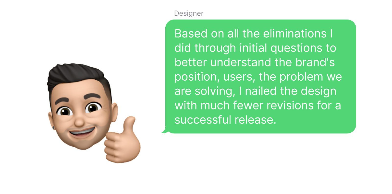
Constraints are your clues to a good, accessible, consistent design. Use them for your strength and do your best to express your creativity within these lines. There is so much you can use your Creativity to contribute to your clients' businesses and users' life.
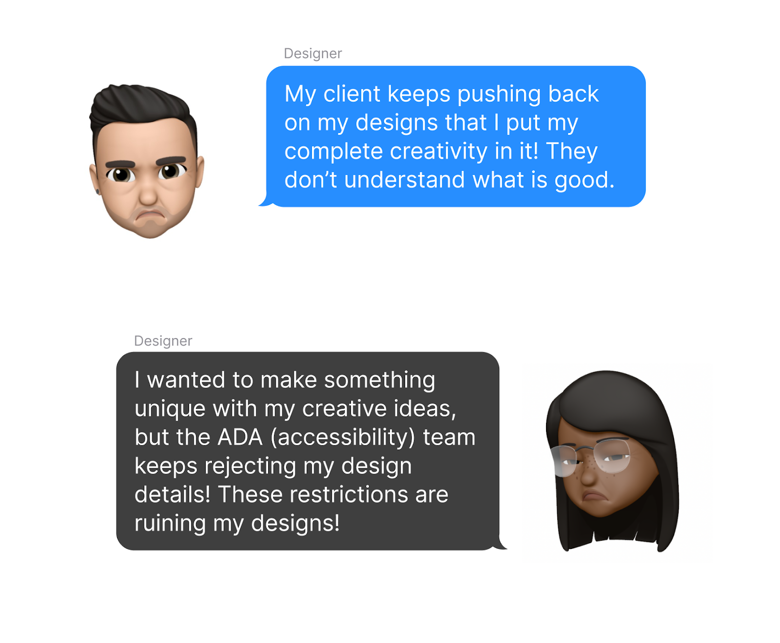
I hear this kind of situation often, especially from Junior Designers who are new in the industry, the idea of "Creative Freedom". It is often understood as designers having the freedom to do as they like in their designs, and if the designer ever goes in that direction, it usually ends up with situations as below.

These kinds of frustrations are more common than you'd think. I'd argue that these constraints are there to help you, not to restrict you.
The situation described above comes close to the argument of "If Designers are Artists.". This is a long topic that I will cover in another post. However, briefly;
Designers are more like engineers who are following a set of rules to create a product for others. Artists do not have rules. They don't need to worry about who is going to use it, see it, interact with it.
Design is done for others, Art is for self.
So, what are these rules designers need to follow?
We can ask a series of questions to better understand these cases;
What platform or media are we designing for?
iOS, Android, Web, Print? Even only this question comes with numerous constraints; For example, if you are designing for iOS, you need to have your buttons height minimum in 44px, so users can easily interact with it. It doesn't matter if you like smaller size buttons. It needs to be as Apple Design Guidelines provides for accessibility. You may have similar guidelines in your organization.
What is the user demographic? Who is going to use this in what conditions?
Teenagers on the go? Professionals in the office? Elders for their care? This brings another set of rules to follow to make the design accessible in these different conditions.
What is the budget?
This affects the time you can spend on explorations and the kind of design you need to make while bearing in mind the development efforts. If you are limited to a short timeline based on business decisions, you may want to explore a simpler design route for the first release that would not take too much design or development time.
Is this a feature for an existing product?
If so, you are most likely to follow an existing style guideline which gives you a list of styles to follow from typography to colours, iconography and more.
Is this for an existing brand? If so, what are the values of this brand and how do they communicate it?
You need to stay consistent with the brand's position and how it is communicated. Let's say the brand strongly stands for simplicity and easy to use interfaces. With this value in mind, you would not spend your time and energy creating highly dynamic and detailed, shiny, colourful designs. No matter how amazing that design is, it is not going to align with the brand's values.
The list and set of questions go on based on your project and client.
Ask as many questions as you need to better understand who you are designing for, what problem you are solving. Eliminate as many directions as possible before starting your design.
What are these 5+ benefits then?
Actually, the questions we covered above are already answering this question : )
1. It saves you time
You don't end up exploring numerous irrelevant designs. From the beginning, various components, design directions are already defined based on the brand and its guidelines. This enables your client to go live and start making revenue sooner. This alone is crucial for the success, I wrote more about this at https://oykun.com/dont-under-promise-over-deliver/
2. It saves you money
As the saying goes, "Time is money" : ) As you save time, you save money. Also, you don't end up spending resources on irrelevant design details.
3. Helps you focus on user and brand
Since you do not need to worry too much about various sizes, spacings, color channels, etc., you can invest your efforts more in how your users are going to interact with your design, how you can better communicate the value of the brand through your design.
4. Helps you design accessible products
ADA guidelines are pretty clear. Having 4.5:1 contrast ratio for normal text, having certain fixed indicators for disabilities, so on... By having these rules predefined, you don't end up going through designs that would fail the ADA tests.
5. Makes you a more empathetic designer
As you ask questions to better understand your clients' position, your users' situation, you better understand them and how to position your design. This is such an important and long topic that I will be covering more in detail in a separate article.

OK, so where does the creativity sit in all these?
Having these constraints doesn't mean you can't put your own touch and creativity on designs.
These constraints are your clues to a good, accessible, consistent design. Use them for your strength and do your best to express your creativity within these lines.
There is so much you can use your Creativity through design within these constraints to contribute to your clients' businesses and users' life.