Yesterday I tweeted few words about "white space", it got some attention and I received emails asking more about it, so I decided to write this short post as an answer.
White spaces in design are not wasted spaces. They clean the environment around the important element and gives better, easier, direct focus
- Oykun (@oykun) March 24, 2013
"White space" is not literally a space with white colour. It's a blank space surrounds a given element. This "blank space" sounds like a waste of space to some out there, which I disagree. Here is why;

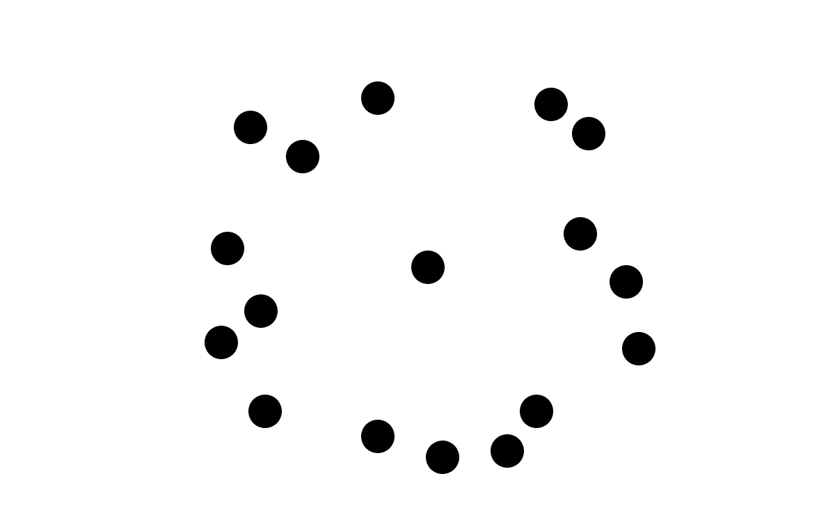
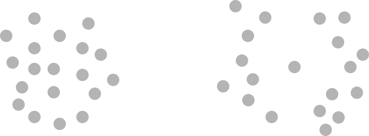
At the example above (using same number of dots), there are lots of information (dots) to present, but one of them is the key information and it needs instant focus to give quick answer to the question; "What is this thing about?".
At the first example, as many information as possible is given in the very smallest space. You may think that you did well, because you give more in small space. Well in my opinion, it is wrong. It causes chaos, user (she) has no clue where to look, where to get the key information. So she spends seconds/minutes to make a sense of it, eventually gets frustrated and goes away. Here you lost a person who might be a potential customer or a reader or anyone else important!
At the second example, white space is given to the key information in the centre. Yes, you are giving less information in the same space, but nothing wrong with it since you are giving the key information which user catches instantly without any effort. She has a clear idea about what it's telling, what it's for, now she can take instant action and explore the information given around if interested. All other dots around is making more sense to her now, because she knows the main subject from the well spaced middle dot.
The middle dot could be a primary button on a remote control device, or an important line in an article, or a key visual in a poster hanged along with many others around… This is an important matter for any possible thing you can think of.

Let's look at some real life examples. Here are 2 search engines. The key element (our middle dot) is search input which user needs to be focused instantly. At the first example (Bing), it is off centred and have lots of messy elements (popups, unrelated information, heavy images, so on) around with inconsistent spacing. It is not doing terrible but still user spends minimum 5–6 seconds, and mostly likely more for unexperienced user group, to eliminate useless information around and focus on the key feature. At the second example (Google) the input is well centred with lots of white space around. The open space around gives user an instant focus to middle point. No distractions, no frustration, no time waste, it is an instant experience, it is a success.
In today's fast moving life, every second is precious for all of us. So let's pay attention to make our products easier to use and understandable in the minimum possible time. Let's give our key information in well spaced format. Let's keep it simple and use white space efficiently. You will see the benefits in no time...